Class assignment to design a logo for our personal brand. From sketch designs to finished product. The name “Torimili” in an amalgam of mine and my children’s first two letters in our names. They’ve always been my driving force and primary motivation to be better than I was the day before.
Original Logo
I designed this logo years ago. The idea comes from the 3 “i”s in my children’s names and the “o” from mine. Originally I loved this design and had no desire to change it, but our instructor told us to approach it as redesign, and since that is not an uncommon request I found that that this would be an interesting challenge, to please myself when I was already happy with what I had.

Redesign:
Step 1: Create at least 12 sketches for logo ideas to decide from.
I wanted to keep with the same idea of using the vowels in the “Torimili” name, but decided to also play around with the consonants to see if I could come up with something I liked that way too.
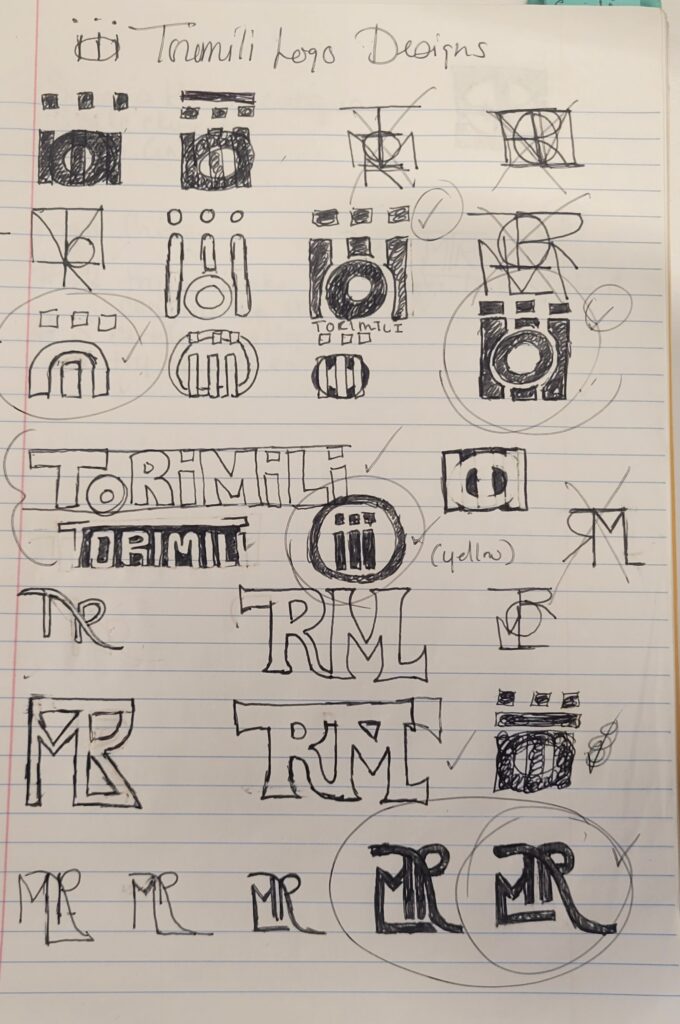
Step 2: Class discussion and critiques of each others designs to help narrow down the choices to our top 6 favorite designs. The majority pick was for design #2, but I didn’t love it and decided to flesh it out some more.
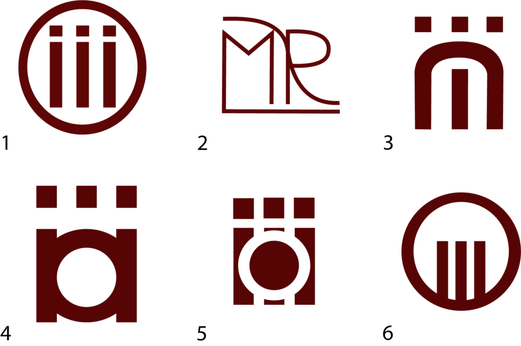
Step 3: Final logo design. I love this design because not only does it look clean and smooth, but if you look at it from a certain point of view you can still see the three “i”s and the “o” in the bottom part of the design.

Step 4: Final design with added wordmark

Program:
Adobe Illustrator
